AI Infographic Video Maker
Transform complex data, statistics, and insights into engaging infographic videos in seconds. Agent Opus AI Infographic Video Maker turns your text prompts, scripts, or blog URLs into polished, motion-rich videos with charts, icons, and dynamic visuals. No design experience, no manual editing, no stock footage hunting. Describe your data story, and Agent Opus generates a publish-ready infographic video optimized for social platforms, presentations, and campaigns. Perfect for marketers, educators, and founders who need to visualize information fast.

Explore what's possible with Agent Opus
Reasons why creators love Agent Opus' AI Infographic Video Maker
Data Tells Stories Instantly
Transform complex statistics into visual narratives that audiences actually remember and share.
Consistent Brand Identity
Every infographic video automatically matches your colors, fonts, and style guidelines without manual tweaking.
Higher Retention Rates
Visual data storytelling keeps viewers engaged longer than static charts or text-heavy slides ever could.
Repurpose Reports in Minutes
Turn existing research, whitepapers, and presentations into engaging video content your audience will watch.
Scale Content Production
Produce multiple infographic videos per week without expanding your team or budget.
No Design Skills Required
Create professional infographic videos without hiring designers or learning complicated software.
How to use Agent Opus’ AI Infographic Video Maker
 1
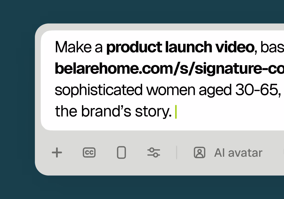
1Describe your video
Paste your promo brief, script, outline, or blog URL into Agent Opus.
 2
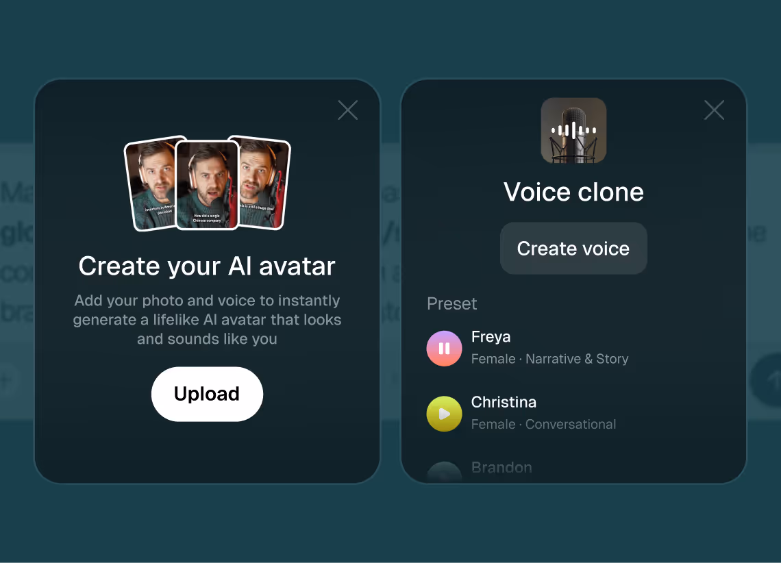
2Add assets and sources
Upload brand assets like logos and product images, or let the AI source stock visuals automatically.
 3
3Choose voice and avatar
Choose voice (clone yours or pick an AI voice) and avatar style (user or AI).
 4
4Generate and publish-ready
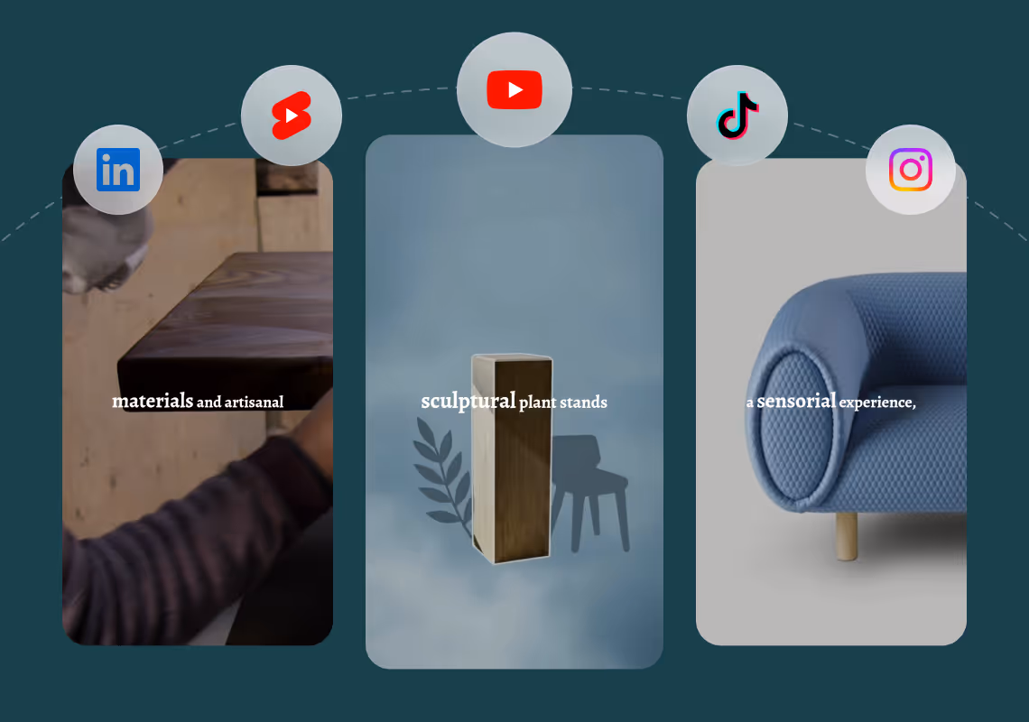
Click generate and download your finished promo video in seconds, ready to publish across all platforms.


8 powerful features of Agent Opus' AI Infographic Video Maker
Template-Free Generation
Generate custom infographic videos from scratch without browsing templates or manual design work.
Multi-Stat Layouts
Present multiple data points in one video with auto-arranged layouts and smooth scene transitions.
Text to Infographic Video
Transform data points and statistics into animated infographic videos with dynamic charts and visual storytelling.
Brand-Matched Infographics
AI applies your color palette and logo to every chart and callout for consistent brand identity.
Voiceover Narration
Add AI-generated voiceover that explains each statistic as animated elements appear on screen.
Instant Chart Animation
Watch bars grow, lines draw, and icons pop in real time as AI choreographs each data reveal.
Social-Ready Formats
Export infographic videos in square, vertical, or landscape dimensions optimized for every platform.
Automated Data Visualization
AI converts numbers and facts into motion graphics with animated bars, pies, and icon-based sequences.
Testimonials
This looks like a game-changer for us. We're building narrative-driven, visually layered content — and the ability to maintain character and motion consistency across episodes would be huge. If Agent Opus can sync branded motion graphics, tone, and avatar style seamlessly, it could easily become part of our production stack for short-form explainers and long-form investigative visuals.
srtaduck
I reviewed version a and I was very impressed with this version, it did very well in almost all aspects that users need, you would only have to make very small changes and maybe replace one of 2 of the pictures, but even saying that it could be used as is and still receive decent views or even chances at going viral depending on the story or the content the user chooses.
Jeremy
all in all LOVE THIS agent. I'm curious to see how I can push it (within reason) Just need to learn to get the consistency right with my prompts
Rebecca
Frequently Asked Questions
How does AI Infographic Video Maker handle raw data versus written summaries?
Agent Opus AI Infographic Video Maker accepts data in multiple formats to fit your workflow. If you have raw numbers—like spreadsheet rows, survey percentages, or quarterly metrics—you can paste them directly into your prompt alongside context about what they represent. The AI interprets the data, selects appropriate chart types (bar graphs, pie charts, line graphs, comparison tables), and animates them with motion graphics that highlight trends and outliers. If you prefer to work from a written summary or blog post that already discusses the data, Agent Opus extracts key statistics, identifies the narrative arc, and visualizes the most important numbers as animated infographics. You can also provide a script that describes each data point in sequence, and the system will generate corresponding visual scenes with charts, icons, and callouts timed to your voiceover. The AI handles visual hierarchy automatically, ensuring primary metrics get larger, bolder treatment while supporting details appear as secondary elements. For best results, include brief context for each number (what it measures, why it matters, how it compares) so the motion graphics can emphasize the right insights. Agent Opus also supports blog URLs: paste a link to an article with embedded statistics, and the AI will extract data points, generate charts, and build an infographic video that summarizes the piece visually. This flexibility means you can start from spreadsheets, written reports, or published content and end with a polished infographic video ready for social media, presentations, or email campaigns.
What are best practices for prompts in AI Infographic Video Maker to get professional results?
To maximize the quality of your infographic videos, structure your prompts with clear data points, context, and desired emphasis. Start by listing your key statistics in order of importance, then add one sentence of context for each number explaining what it represents and why it matters to your audience. For example, instead of writing 'Revenue up 40%,' write 'Q4 revenue increased 40% year-over-year, driven by new product launches in the enterprise segment.' This gives Agent Opus the narrative thread it needs to select appropriate visuals, icons, and motion graphics that reinforce the story behind the numbers. Specify your target audience and tone—are you presenting to investors (formal, data-heavy), educating consumers (simple, metaphor-rich), or rallying a team (inspirational, achievement-focused)? The AI adjusts visual style, pacing, and voiceover tone accordingly. If you want specific chart types, mention them: 'Show this as a line graph with annotations at peak months' or 'Use a comparison bar chart for these two segments.' Include brand guidelines if consistency matters: 'Use our logo in the lower third, primary color is navy blue, avoid red.' For voiceover, indicate whether you want a professional narrator tone, conversational style, or energetic delivery. If you have a script, break it into short sections that correspond to individual data points or visual beats—this helps the AI pace scene transitions and sync motion graphics to narration. Avoid vague prompts like 'Make a video about our growth'; instead, provide the actual numbers, timeframes, and comparisons. The more specific your input, the more polished and on-message your infographic video will be.
Can AI Infographic Video Maker maintain consistent branding across multiple videos?
Yes, Agent Opus AI Infographic Video Maker supports brand consistency through logo integration, color palette application, and visual style memory. When you generate your first infographic video, include your brand assets in the prompt: upload your logo, specify primary and secondary colors (hex codes or color names), and describe your visual style (minimalist, bold, corporate, playful). Agent Opus applies these elements across all scenes—your logo appears in a consistent position (lower third, corner, or end card), charts and graphics use your brand colors for data series, and motion graphics match your aesthetic guidelines. If you generate multiple infographic videos over time, you can reference previous projects or save brand presets so the AI recalls your visual identity without re-uploading assets. This is especially valuable for recurring content like monthly performance reports, weekly industry updates, or campaign series where viewers expect a recognizable look and feel. The AI also maintains typographic consistency: if your first video uses a clean sans-serif font for headlines and a lighter weight for body text, subsequent videos will follow the same hierarchy. Background music and voiceover tone can also be standardized—choose a voice clone of your team member or select an AI voice that becomes your brand's signature narrator. For teams managing multiple clients or product lines, you can create separate brand profiles within Agent Opus, ensuring each infographic video aligns with the correct visual identity. This eliminates the manual work of applying brand guidelines in traditional design tools and ensures every data visualization reinforces your professional image across LinkedIn, investor decks, and marketing campaigns.
What types of data and statistics work best in AI Infographic Video Maker?
Agent Opus AI Infographic Video Maker excels with quantitative data that tells a clear story: growth metrics, comparisons, trends over time, survey results, market share breakdowns, and performance benchmarks. The AI is optimized for datasets where numbers have context and narrative significance—quarterly revenue growth, customer satisfaction scores, website traffic changes, product adoption rates, demographic distributions, or competitive analysis. Simple before-and-after comparisons work exceptionally well: 'Our response time dropped from 48 hours to 2 hours after implementing the new system' becomes an animated bar chart with a dramatic visual shift. Multi-variable data like 'Sales by region and product category over six quarters' can be visualized as layered charts with animated transitions that highlight key insights. Survey results with percentages—'72% of users prefer feature A, 18% prefer feature B, 10% are undecided'—translate into pie charts or stacked bars with callouts emphasizing the majority preference. Time-series data (monthly signups, yearly emissions reductions, daily active users) becomes line graphs with annotations marking inflection points. The AI also handles qualitative insights when paired with supporting numbers: 'Customer retention improved due to three factors' can be visualized as icons with percentage contributions for each factor. For best results, provide data that has a clear takeaway or decision point—infographic videos are most effective when they drive viewers toward a conclusion or action. Avoid overly complex datasets with dozens of variables; instead, distill your data into 3-7 key points that build a cohesive narrative. Agent Opus will generate motion graphics that guide viewers through the logic, using visual hierarchy, color emphasis, and animated reveals to make even dense statistics feel accessible and compelling.